Wednesday, 26 June 2013
Google Reader replacements: follow-up
I wish I could say the past few days’s evaluation resulted in a feed reader I unequivocally prefer, but it hasn’t. The only one I have decided to abandon for the moment is Feed Wrangler. While its mobile app is among the best of the bunch, its Web app is so feature-poor as to be unusable, and remedying its failure to import my Google Reader feed groups (tags) into its equivalent, Smart Streams, would require a lot of manual work. A desktop app would be an acceptable replacement for Feed Wrangler’s Web site, but I frequently read news from computers that aren’t my own, and I’ve also become accustomed to reading from within a browser-based environment.
My final-for-now thoughts on the other options: (Later updates are in italics.)
The Old Reader
The Old Reader has continued to be fast and reliable. It’s the only Google Reader alternative I evaluated that lets you start reading, and keep reading, exclusively with the space bar. I find its unread indicator too subtle (a vertical green bar, which is to the left of a much larger green box, with no corresponding change in the title’s typeface), and still wish for a way to hide the sidebar, but am otherwise pretty happy with its Web reading interface. Since my first post on it, there’s now an initial mobile API for The Old Reader; in time I imagine it’ll get some good app support. At the moment, its Web-only nature, even with a good mobile Web site, is a non-starter.
NewsBlur
NewsBlur has been the only reader for which I have had some very nice communication from its primary author, Samuel Clay, who clearly cares a lot about his users. I paid for NewsBlur and plan to continue following its development. That said, I don’t think I can adopt it yet.
NewsBlur has nearly everything I want in theory, including some really wonderful and unique features — for example, the ability to fetch article text from the iOS client is terrific, given it also bypasses broken mobile redirects. However, I think NewsBlur could benefit from more of “if you can't implement a feature reliably, don’t implement it at all” — many things end up buggy or frustrating in practice.
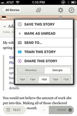
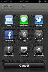
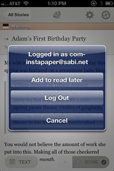
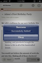
Of the issues I complained about in my previous post, the feed folder expansion race and the 5-tap mobile add-to-Instapaper process (above) remain the most annoying. Some more issues I’ve run into since:
- Most of the time the Web app is fast to start up. But sometimes when I hit E to start reading, there’s a 3–10 second delay while “Fetching Stories” appears at the top of the window. With Google Reader, these 3–10 seconds could have been my entire news-reading session. As of June 28, this is fixed: “Launched the rewritten river. Folders now load 8-20X faster.”
- Some of my feeds were incorrectly deduplicated — generally a more specific feed turning into a broader feed — upon Google Reader import (a workaround is available).
- The iOS app requires I tap “All Stories” to start reading; the top item in the list is “Global Shared Stories” (which I never want). The tap targets in the list on iPhone are too small vertically, so I’ve mistapped quite a few times here. I’ve been successfully tapping on the equivalent, but larger, item in NetNewsWire (“Latest News (24 hours)”) for years. It isn’t the top item in the list either, so simply enlarging the vertical size of this item should be adequate. This is fixed for iPad in version 4.0 of the iOS app, which now opens to the All Stories list. I have started using “Global Shared Stories”, too.
- The feed title gets more prominence than the article title. It lives in a horizontal bar (on both Web and mobile) which varies in color based on the favicon. If the favicon is bright orange, for example, you can see the problem:
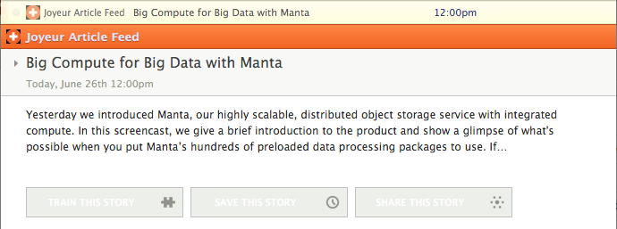
This is something that none of the other readers do — Google Reader, Feed Wrangler and NewsBlur put the feed title below the article title, while The Old Reader puts the feed title in a tag-like box above the article title, and Feedly puts it above the title in small gray text. This is worst on the article list screen of NewsBlur’s iOS app — the article title is too small to stand out. - The list view doesn’t display the beginning of the article body. Of the other readers, Feedly and The Old Reader do this, just as Google Reader did. Without it, it’s more difficult for me to skim feeds effectively. This is now an option as of version 4.0 of the iOS app.
- The feed title in the sidebar gets truncated on a word boundary without an ellipsis, versus character-level breaking with an ellipsis in the other readers. The worst offender has been Gimme Hardware/Software Interface., which gets truncated to “Gimme”. (I should really unsubscribe from that one, it’s dead). This has since been fixed.
- The iOS app doesn’t hide the sidebar on iPad in portrait orientation, making the article-reading area too narrow. This is fixed as of version 4.0 of the iOS app; you can change the sidebar list of articles into a vertically split view if you wish.
- If you use return/shift-return to switch from Feed to Text or Story view, there’s no way to get back to Feed from the keyboard that I can discover, short of switching articles.
- While space/shift-space will page up/down in a story/original view, page up/down and home/end don’t work as expected.
Feedly
Feedly has been fast and reliable since I’ve been using it. By cloning the Google Reader API, it is gaining a lot of third-party app support quickly. (NewsBlur’s API is different, for example.)
I’ve even grown to appreciate the horizontal-pagination/swipe-vertically-to-mark-read UI of the mobile apps; it encourages scanning the headlines before you read anything. It is possible to change this, sort of, by switching “Transition” in “Look and Feel” advanced settings to “Stack” or “Scroll” from “Swipe”; however, none of the options give you a continuously scrolling list; they just interchange horizontal and vertical axes. The lack of any documentation makes discovery of these behaviors rather annoying.
I still dislike Feedly’s…
- gigantic left margin and wide line spacing of its article view which requires I use a wide browser window
- inability to mark an open article as unread (the keyboard command doesn’t work and clicking the link closes the article)
- huge array of mystery meat icons
- anemic iOS in-app browser
- nonexistent feed error handling
- failure to mark items as read sometimes, probably because it doesn’t provide any information about when it’s updating the server
I also want to pay Feedly for its service, which is not (yet) an option.
But for now, I’m going with Feedly. Given its popularity, it may yet end up being another triumph of worse-is-better. Jamie Zawinski seems to have come to a similar conclusion (if you didn’t know already: NSFW language.) His rant provoked an informative response from a Feedly employee, worth reading.
While I did start with Feedly, I pretty soon ended up switching to NewsBlur and sticking with it. NewsBlur has matured a lot over the months since I wrote this article, fixing most of my annoyances above, fixing bugs and adding wonderful new features. Samuel Clay continues to be an awesome force for good, and as it’s open source, I’ve even contributed a little bit to the iOS app. The two major features it lacks are a feed organizer (currently under construction) and a Google Reader-scale search capability (hard to do without a huge resource footprint, but perhaps coming eventually).
 5:12 PM