Sunday, 23 June 2013
Google Reader replacements: NewsBlur
Today I’m looking at NewsBlur. I had previously tried it a few months ago, but it was recently redesigned and is definitely worth a look as a potential Google Reader replacement.
NewsBlur has more features than the other alternatives I’ve investigated, though many of its sharing/prioritization features I doubt I will use. While the hosted version is paid, the Web application and iOS/Android mobile apps are all open source. As with Feed Wrangler, NewsBlur appears to be written primarily by one person, which is pretty amazing.
Web
The NewsBlur Web UI is a combination of some terrific ideas and a few questionable designs.
Overall, NewsBlur is consistently responsive. The author has stated that he’s aiming for a 100 ms average response time, and even with the last day’s average load time (currently 240 ms, displayed on the site’s “dashboard” home page) I haven’t been frustrated with NewsBlur’s performance. Scrolling between articles within a page doesn’t incur any noticeable delay, regardless.
Unlike some other readers where alternative views seem to be more eye candy than functional, the views available in NewsBlur are clearly designed with real usage in mind. The same is true about NewsBlur’s animations; they can be turned off, though left on, they help and don’t distract.
Your primary choice is between Split and List views. The first displays continuously scrolling full articles, like Google Reader’s Expanded view (or one article at a time, a preference) in one pane with an article list in another pane (which may be on the top, left or bottom). Arrow keys scroll the article pane, and an orange arrowhead indicates which article will be acted upon with other keyboard commands. The arrowhead can be “locked” to point at any vertical position relative to the visible area, or moved with the mouse. List view is like Google Reader’s List view; compared with Split view, the panes are merged, with the list entries appearing above an article and only one article body displayed at a time.
In addition to the Split/List choice, several article displays (which NewsBlur calls “site views”) are available: Feed, Text and Story (the latter only available in Split view). Feed is what you expect. Text embeds the text of the linked page as if it were feed content — great for sites that don’t have full-text views, if not their advertisers. Story displays the full Web site, replacing the continuously scrolling pane.
You can either switch from Feed to Text or Story with the ←/→ keys — even displaying an article as a Story, keyboard commands work to move between articles while keeping the same display format — or use return or shift–return to display just the current article in Story or Text, respectively; navigating to another article returns to Feed.
When viewing an individual feed rather than a folder or all feeds, a fourth site view “Original” displays the site’s main page, and you can navigate between articles with keyboard commands. For obvious reasons it isn’t 100% reliable but is pretty fun to use.
As with all the other feed readers I’ve tried, you can’t use the space bar to start reading, but j works. Unlike the other feed readers I’ve tried, you can hide all vestiges of the feed list sidebar! U does exactly that, and there’s a F full screen toggle which also hides an article list pane if you’re using it. m doesn’t mark as unread, but u does. Assuming you don’t view inline as a Story, sites are opened in a background tab by default with v (or o); V opens in a background window.
NewsBlur imports your starred items from Google Reader as “saved stories” (mine generally date to before my relatively-recent adoption of Instapaper).
Last but certainly not least, NewsBlur has an option to display diffs when an article changes; NetNewsWire for Mac has had a similar feature for years and I’ve missed it.
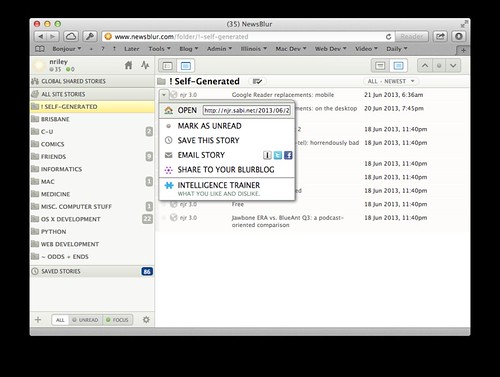
Now for the questionable parts. Like Visual Studio 2012, NewsBlur suffers from an overuse of ALL CAPS. This is worst in the popup menus:
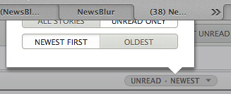
From the above screenshot you can see that NewsBlur uses a white button background to indicate “selected”. This is OK on a gray background, but can be pretty confusing on a white background:
And yes, the above is a popup that appears partially off the Web page. Oops.
I saved the worst for last. Instead of adopting more common convention of popup menus at the right side of a list item and expansion controls at the left, NewsBlur puts popup menu behind disclosure triangle-looking icons that appear on mouse-over on the left side, and a +/– expansion control on the right side. But try to use it…
(The locations of these controls is an intentional design decision, though one I continue to disagree with.)
iOS
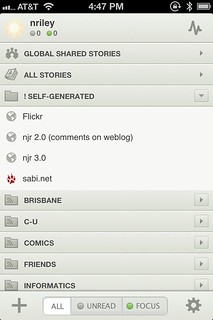
The NewsBlur iOS app is quite good. Its UI is a clear relative of the Web UI, but uses enough standard iOS paradigms to be discoverable (from digging around on the Web site, earlier versions used more standard controls). There’s a bit too much of a tendency to small gray text in article lists, so Feed Wrangler definitely has a readability advantage.
In a wonderful display of UI consistency, the disclosure triangles in the iOS app are actual disclosure triangles, still on the wrong side, and don’t pop up menus. Sigh.
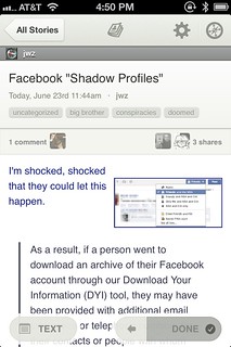
You can’t tap on an article title to view it in the built-in browser as with all the other mobilereaders I’ve tried — instead, you tap the Safari icon in the top right. You can move between articles with a horizontal swipe, in addition to a nicely-done “next” control at the bottom right which also displays a circular indicator of how far you have progressed in your unread articles, or “done” if you’ve read them all.
The iOS embedded browser looks great — displaying page titles, back and forward buttons, and a “Close” button rather than an overloaded back button. But it’s also strangely persistent, maintaining a history across multiple posts, and displaying the last page you viewed with an “On its way…” overlay while a new page is loading.
Sending to Instapaper takes too many taps (action menu, Send to…, then tapping Instapaper). There’s no support for Pinboard or other bookmarking services.
The app sometimes needs a bit of prodding to force it into retrieving all articles, rather than unread articles. It has some minimal offline support for short-term network disruptions — more than Feedly, less than Feed Wrangler or NetNewsWire, made more tolerable with an awesome vintage Mac icon when it can’t make a network connection. From a recent tweet it appears this will be improving.
Over the past few days I’ve been using both Feed Wrangler and Feedly in addition to Google Reader, which I may end up using to the bitter end. The Old Reader’s lack of mobile support has put it out of the running. I’m adding NewsBlur to the mix and will post an update when I’ve made a final decision.


 7:19 PM
[…] Of the issues I complained about in my previous post, the feed folder expansion race and the 5-tap mobile add-to-Instapaper process (above) remain the most annoying. Some more issues I’ve run into since: […]