Archives / Search ›

External enclosure woes

Today some images have been circulating Twitter, comparing the expected cable disaster likely to follow the new Mac Pro with old Apple advertising emphasizing the clutter-free nature of Apple’s all-in-one Macs. I happened to be retiring an external drive dock today, which reminded me — not only are external enclosures and their associated power bricks cumbersome and ugly, they’re incredibly unreliable.

My last traditional tower-style desktop Mac was a G4 from 2001, during which I transitioned from tape- to hard drive-based backup; since then my family’s non-laptop Macs have included an iMac and three Mac minis, so I’ve become very familiar with external enclosures and drive docks. The state of the art in these devices is just bad, and has been for years. I’ve had more hardware failures, both of the drives and their enclosures, than with any other electronics product I’ve used in the past decade.

Inevitably when I go to buy another enclosure, I end up spending hours digging through piles of unreliable, flimsy, ugly products to find something vaguely tolerable. The only real advance I can think of in this period has been the emergence of toaster-style docks as made possible by SATA connectors.

External drive issues

Let’s go through the pile currently on my desk, and some of its former residents:

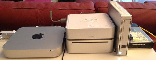
The power supply for the drive plugged into the ATA FireWire DriveDock (right) died a few years ago; I successfully bypassed it, since the bridge board itself is FireWire-powered.

The Newer miniStack v3 (center) is a replacement; the first such device had its bridge chip stop communicating over FireWire within a few months. The current device’s fan, for which replacements were not available, started making horrible noises after the warranty expired; I ran it with the top off for a few years so the fan didn’t have to come on, then the fan mysteriously quieted back down again.  The power/access LEDs on the front work very intermittently.

The Icy Dock enclosure to its right (a relative of this, but with FireWire 800), in a less well-ventilated location, managed to destroy 2 drives through overheating before we discovered what was going on. Overheating problems even extend to the drive manufacturers’ own enclosures.

More issues revolve around old bridge chip firmware in an otherwise functional enclosure. While most FireWire 800-capable bridge chips just include ARM cores with firmware on them, good luck finding an update. For example, the Icy Dock’s chip has firmware that can’t handle Advanced Format drives, such as one WD sent as a warranty replacement for a non-Advanced Format drive. I ended up buying a replacement enclosure, which did support current drives, and inheriting the original enclosure.

My first 2.5ʺ bus-powered FireWire enclosure—the blue and gray one at right in this picture—fried the only FireWire port in my father’s PowerBook G4 (thankfully covered under warranty) as well as one in my Power Mac G4 (for which I ended up buying a FireWire 800 PCI card).

An USB2 to SATA/IDE adapter was constructed of such flimsy plastic that it was possible to insert the Molex power connector upside down, frying both the adapter and the attached drive.

Finally, I retired a Plugable docking station today because it doesn’t spin down idle drives (even with this firmware update, it takes a few minutes after unmounting, versus immediate spindown with other enclosures I’ve used).

In fact, the only daily-use external enclosure I’ve had no problems with has been my original USB 2 Thermaltake BlacX.

Then there’s the inability of hard drive diagnostic utilities to run on USB- or FireWire-attached drives. You can’t even view SMART status, which when your drive misbehaves, leaves you to guess from I/O errors, or beg someone with an actual internal drive bay to test for you.

As long as large SSDs remain prohibitively expensive for most users, media sizes keep growing and network speeds make local clones/backups necessary for disaster recovery, we’ll be dealing with these devices. Maybe there’ll be a better solution? The past doesn’t make me terribly optimistic.
Google Reader replacements: follow-up

I wish I could say the past few days’s evaluation resulted in a feed reader I unequivocally prefer, but it hasn’t. The only one I have decided to abandon for the moment is Feed Wrangler. While its mobile app is among the best of the bunch, its Web app is so feature-poor as to be unusable, and remedying its failure to import my Google Reader feed groups (tags) into its equivalent, Smart Streams, would require a lot of manual work. A desktop app would be an acceptable replacement for Feed Wrangler’s Web site, but I frequently read news from computers that aren’t my own, and I’ve also become accustomed to reading from within a browser-based environment.

My final-for-now thoughts on the other options: (Later updates are in italics.)

The Old Reader

The Old Reader has continued to be fast and reliable. It’s the only Google Reader alternative I evaluated that lets you start reading, and keep reading, exclusively with the space bar. I find its unread indicator too subtle (a vertical green bar, which is to the left of a much larger green box, with no corresponding change in the title’s typeface), and still wish for a way to hide the sidebar, but am otherwise pretty happy with its Web reading interface. Since my first post on it, there’s now an initial mobile API for The Old Reader; in time I imagine it’ll get some good app support. At the moment, its Web-only nature, even with a good mobile Web site, is a non-starter.

NewsBlur

NewsBlur has been the only reader for which I have had some very nice communication from its primary author, Samuel Clay, who clearly cares a lot about his users. I paid for NewsBlur and plan to continue following its development. That said, I don’t think I can adopt it yet.

NewsBlur has nearly everything I want in theory, including some really wonderful and unique features — for example, the ability to fetch article text from the iOS client is terrific, given it also bypasses broken mobile redirects. However, I think NewsBlur could benefit from more of “if you can't implement a feature reliably, don’t implement it at all” — many things end up buggy or frustrating in practice.

NewsBlur iPhone Instapaper, part 1NewsBlur iPhone Instapaper, part 2NewsBlur iPhone Instapaper, part 3NewsBlur iPhone Instapaper, part 4

Of the issues I complained about in my previous post, the feed folder expansion race and the 5-tap mobile add-to-Instapaper process (above) remain the most annoying. Some more issues I’ve run into since:

  • Most of the time the Web app is fast to start up. But sometimes when I hit E to start reading, there’s a 3–10 second delay while “Fetching Stories” appears at the top of the window. With Google Reader, these 3–10 seconds could have been my entire news-reading session. As of June 28, this is fixed: “Launched the rewritten river. Folders now load 8-20X faster.”
  • Some of my feeds were incorrectly deduplicated — generally a more specific feed turning into a broader feed — upon Google Reader import (a workaround is available).
  • The iOS app requires I tap “All Stories” to start reading; the top item in the list is “Global Shared Stories” (which I never want). The tap targets in the list on iPhone are too small vertically, so I’ve mistapped quite a few times here. I’ve been successfully tapping on the equivalent, but larger, item in NetNewsWire (“Latest News (24 hours)”) for years. It isn’t the top item in the list either, so simply enlarging the vertical size of this item should be adequate. This is fixed for iPad in version 4.0 of the iOS app, which now opens to the All Stories list. I have started using “Global Shared Stories”, too.
  • The feed title gets more prominence than the article title. It lives in a horizontal bar (on both Web and mobile) which varies in color based on the favicon. If the favicon is bright orange, for example, you can see the problem:
    NewsBlur orange site bar
    This is something that none of the other readers do — Google Reader, Feed Wrangler and NewsBlur put the feed title below the article title, while The Old Reader puts the feed title in a tag-like box above the article title, and Feedly puts it above the title in small gray text. This is worst on the article list screen of NewsBlur’s iOS app — the article title is too small to stand out.
  • The list view doesn’t display the beginning of the article body. Of the other readers, Feedly and The Old Reader do this, just as Google Reader did. Without it, it’s more difficult for me to skim feeds effectively. This is now an option as of version 4.0 of the iOS app.
  • The feed title in the sidebar gets truncated on a word boundary without an ellipsis, versus character-level breaking with an ellipsis in the other readers. The worst offender has been Gimme Hardware/Software Interface., which gets truncated to “Gimme”. (I should really unsubscribe from that one, it’s dead). This has since been fixed.
  • The iOS app doesn’t hide the sidebar on iPad in portrait orientation, making the article-reading area too narrow. This is fixed as of version 4.0 of the iOS app; you can change the sidebar list of articles into a vertically split view if you wish.
  • If you use return/shift-return to switch from Feed to Text or Story view, there’s no way to get back to Feed from the keyboard that I can discover, short of switching articles.
  • While space/shift-space will page up/down in a story/original view, page up/down and home/end don’t work as expected.
Finally, I should mention that NewsBlur is currently limited to unread articles at most 14 days old. This is an architectural limitation which, personally, doesn’t bother me — I never leave articles unread for more than a day or two, using Instapaper if I want to take longer to get to something — but I can see it affecting some reading styles. This has now changed to 30 days for paid NewsBlur accounts, and I continue not to find it a problem.

Feedly

Feedly has been fast and reliable since I’ve been using it. By cloning the Google Reader API, it is gaining a lot of third-party app support quickly. (NewsBlur’s API is different, for example.)

I’ve even grown to appreciate the horizontal-pagination/swipe-vertically-to-mark-read UI of the mobile apps; it encourages scanning the headlines before you read anything. It is possible to change this, sort of, by switching “Transition” in “Look and Feel” advanced settings to “Stack” or “Scroll” from “Swipe”; however, none of the options give you a continuously scrolling list; they just interchange horizontal and vertical axes. The lack of any documentation makes discovery of these behaviors rather annoying.

I still dislike Feedly’s…

  • gigantic left margin and wide line spacing of its article view which requires I use a wide browser window
  • inability to mark an open article as unread (the keyboard command doesn’t work and clicking the link closes the article)
  • huge array of mystery meat icons
  • anemic iOS in-app browser
  • nonexistent feed error handling
  • failure to mark items as read sometimes, probably because it doesn’t provide any information about when it’s updating the server

I also want to pay Feedly for its service, which is not (yet) an option.

But for now, I’m going with Feedly. Given its popularity, it may yet end up being another triumph of worse-is-better. Jamie Zawinski seems to have come to a similar conclusion (if you didn’t know already: NSFW language.) His rant provoked an informative response from a Feedly employee, worth reading.

While I did start with Feedly, I pretty soon ended up switching to NewsBlur and sticking with it. NewsBlur has matured a lot over the months since I wrote this article, fixing most of my annoyances above, fixing bugs and adding wonderful new features. Samuel Clay continues to be an awesome force for good, and as it’s open source, I’ve even contributed a little bit to the iOS app. The two major features it lacks are a feed organizer (currently under construction) and a Google Reader-scale search capability (hard to do without a huge resource footprint, but perhaps coming eventually).

Google Reader replacements: broken feed handling

Several of the feeds I was subscribed to were moribund and/or broken. There are some significant differences in how the various readers handle them. Here are a couple of representative examples:

FatBits, John Siracusa’s old Ars Technica staff blog

The URL for this feed was http://arstechnica.com/staff/fatbits.rssx. This returns a 301 (Moved Permanently) redirecting to /staff/, which is not a feed. This is clearly breakage on Ars’s part.

  • The Old Reader scraped the redirected-to page and pulled a feed URL out of it, http://feeds.arstechnica.com/arstechnica/index/, but kept the old title, so the main Ars feed appears as “FatBits: John Siracusa’s Journal”.
  • Feedly just says “No unread articles”; I’m unaware of a way to view errors from it, or even the feed URL without pulling it out of the page URL.
  • Feed Wrangler also scraped the redirected-to page, but changed the title to “Ars Technica”.
  • NewsBlur somehow figured out that the correct URL should be http://feeds.arstechnica.com/arstechnica/staff/fatbits/ and used that. It changed the title to “Ars Technica » John Siracusa” based on the feed, as well.

Clearly NewsBlur’s behavior is the best here; if you try to subscribe to a broken feed, it also provides a search interface with some great suggestions. Feed Wrangler is acceptable; The Old Reader less so, and Feedly not at all.

Canned Platypus, now Platypus Reloaded, Jeff Darcy’s blog

The URL for this feed was http://pl.atyp.us/wordpress/?feed=atom. At various times this was a broken redirect to http://pl.atyp.us/wordpress/index.php/feed/atom/, which currently returns 404 Not Found.

  • The Old Reader followed the broken redirect, but does not show the 404 anywhere, even when I click “Refresh”. Articles are shown, presumably from when the URL worked.
  • Feedly probably followed a redirect at another time, so it has http://pl.atyp.us/wordpress/feed/atom/ instead, which also returns a 404 — this information is not visible anywhere I can see, and there are no articles in the feed visible.
  • Feed Wrangler was able to discover a valid feed address, http://pl.atyp.us/wordpress/index.php/feed/, and even displays a combination of the old and new feeds with appropriate site titles.
  • NewsBlur displays an ! icon that, when clicked on, pops up a resolution interface with useful options. Clicking “Fetch Feed From Website”, as recommended, causes the feed to correctly change to http://pl.atyp.us/wordpress/index.php/feed/, though I repeatedly saw hangs when clicking “Retry Fetching and Parsing”.

Feed Wrangler did the right thing automatically; in addition, its combination of old and new feeds is exemplary. NewsBlur has a pretty good solution, though it requires manual intervention, exhibited some flakiness and necessitated the folder be expanded to see the ! icon. The Old Reader and Feedly’s ambivalence to errors was not appreciated.

Google Reader replacements: NewsBlur

Today I’m looking at NewsBlur. I had previously tried it a few months ago, but it was recently redesigned and is definitely worth a look as a potential Google Reader replacement.

NewsBlur has more features than the other alternatives I’ve investigated, though many of its sharing/prioritization features I doubt I will use. While the hosted version is paid, the Web application and iOS/Android mobile apps are all open source. As with Feed Wrangler, NewsBlur appears to be written primarily by one person, which is pretty amazing.

Web

The NewsBlur Web UI is a combination of some terrific ideas and a few questionable designs.

Overall, NewsBlur is consistently responsive. The author has stated that he’s aiming for a 100 ms average response time, and even with the last day’s average load time (currently 240 ms, displayed on the site’s “dashboard” home page) I haven’t been frustrated with NewsBlur’s performance. Scrolling between articles within a page doesn’t incur any noticeable delay, regardless.

Unlike some other readers where alternative views seem to be more eye candy than functional, the views available in NewsBlur are clearly designed with real usage in mind. The same is true about NewsBlur’s animations; they can be turned off, though left on, they help and don’t distract.

Your primary choice is between Split and List views. The first displays continuously scrolling full articles, like Google Reader’s Expanded view (or one article at a time, a preference) in one pane with an article list in another pane (which may be on the top, left or bottom). Arrow keys scroll the article pane, and an orange arrowhead indicates which article will be acted upon with other keyboard commands. The arrowhead can be “locked” to point at any vertical position relative to the visible area, or moved with the mouse. List view is like Google Reader’s List view; compared with Split view, the panes are merged, with the list entries appearing above an article and only one article body displayed at a time.

In addition to the Split/List choice, several article displays (which NewsBlur calls “site views”) are available: Feed, Text and Story (the latter only available in Split view). Feed is what you expect. Text embeds the text of the linked page as if it were feed content — great for sites that don’t have full-text views, if not their advertisers. Story displays the full Web site, replacing the continuously scrolling pane.

You can either switch from Feed to Text or Story with the / keys — even displaying an article as a Story, keyboard commands work to move between articles while keeping the same display format — or use return or shiftreturn to display just the current article in Story or Text, respectively; navigating to another article returns to Feed.

When viewing an individual feed rather than a folder or all feeds, a fourth site view “Original” displays the site’s main page, and you can navigate between articles with keyboard commands. For obvious reasons it isn’t 100% reliable but is pretty fun to use.

As with all the other feed readers I’ve tried, you can’t use the space bar to start reading, but j works. Unlike the other feed readers I’ve tried, you can hide all vestiges of the feed list sidebar! U does exactly that, and there’s a F full screen toggle which also hides an article list pane if you’re using it. m doesn’t mark as unread, but u does. Assuming you don’t view inline as a Story, sites are opened in a background tab by default with v (or o); V opens in a background window.

NewsBlur imports your starred items from Google Reader as “saved stories” (mine generally date to before my relatively-recent adoption of Instapaper).

Last but certainly not least, NewsBlur has an option to display diffs when an article changes; NetNewsWire for Mac has had a similar feature for years and I’ve missed it.

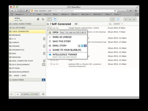
Now for the questionable parts. Like Visual Studio 2012, NewsBlur suffers from an overuse of ALL CAPS. This is worst in the popup menus:

NewsBlur menus

From the above screenshot you can see that NewsBlur uses a white button background to indicate “selected”. This is OK on a gray background, but can be pretty confusing on a white background:

NewsBlur UI glitch

And yes, the above is a popup that appears partially off the Web page. Oops.

I saved the worst for last. Instead of adopting more common convention of popup menus at the right side of a list item and expansion controls at the left, NewsBlur puts popup menu behind disclosure triangle-looking icons that appear on mouse-over on the left side, and a +/– expansion control on the right side. But try to use it…

(The locations of these controls is an intentional design decision, though one I continue to disagree with.)

iOS

The NewsBlur iOS app is quite good. Its UI is a clear relative of the Web UI, but uses enough standard iOS paradigms to be discoverable (from digging around on the Web site, earlier versions used more standard controls). There’s a bit too much of a tendency to small gray text in article lists, so Feed Wrangler definitely has a readability advantage.

NewsBlur iPhone

In a wonderful display of UI consistency, the disclosure triangles in the iOS app are actual disclosure triangles, still on the wrong side, and don’t pop up menus. Sigh.

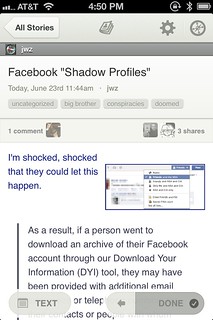
NewsBlur iPhone article

You can’t tap on an article title to view it in the built-in browser as with all the other mobilereaders I’ve tried — instead, you tap the Safari icon in the top right. You can move between articles with a horizontal swipe, in addition to a nicely-done “next” control at the bottom right which also displays a circular indicator of how far you have progressed in your unread articles, or “done” if you’ve read them all.

NewsBlur iPhone browser

The iOS embedded browser looks great — displaying page titles, back and forward buttons, and a “Close” button rather than an overloaded back button. But it’s also strangely persistent, maintaining a history across multiple posts, and displaying the last page you viewed with an “On its way…” overlay while a new page is loading.

Sending to Instapaper takes too many taps (action menu, Send to…, then tapping Instapaper). There’s no support for Pinboard or other bookmarking services.

The app sometimes needs a bit of prodding to force it into retrieving all articles, rather than unread articles. It has some minimal offline support for short-term network disruptions — more than Feedly, less than Feed Wrangler or NetNewsWire, made more tolerable with an awesome vintage Mac icon when it can’t make a network connection. From a recent tweet it appears this will be improving.

Over the past few days I’ve been using both Feed Wrangler and Feedly in addition to Google Reader, which I may end up using to the bitter end. The Old Reader’s lack of mobile support has put it out of the running. I’m adding NewsBlur to the mix and will post an update when I’ve made a final decision.

Google Reader replacements: mobile

In my previous post I discussed the Web UIs of three newish feed readers. Of these, The Old Reader, as a spare-time project, has a nicely mobile-adaptive Web app and an API in development but no iOS app. Feed Wrangler and Feedly have “official” iOS apps which display natively on both iPad and iPhone/iPod touch. These apps are quite different from one another, thus less amenable to bulleted lists than their Web counterparts.

Feed Wrangler

Feed Wrangler is very much a “classic” iOS app with card-stack navigation and a toolbar at the bottom of the screen. I don’t really mind this as I’ve been using the similarly-organized iPhone NetNewsWire for years. Everything works as you’d expect, with a minor conceit of the “Edit” button being labeled “Wrangle”. Article lists and article views are clearly presented, thankfully without gratuitous extra space as in the Web app. You move between articles with arrow buttons, though I wish the down-arrow were a bit further from the edge of the screen on iPhone (as this is the most common action you’ll perform, it makes sense to make the button bigger). Controls for starring, marking unread (still missing in NetNewsWire iPhone!), sending to Instapaper and sharing—including support for Chrome, Netbot and Drafts—are all obvious and well implemented.

There are no folders/collections/tags for feeds, a feature deficit in the Web app as well. I sometimes want to read only a subset of my feeds when I’m running behind (e.g., professional or frivolous stuff), which this would not allow me to do. There’s no display of the number of items in each category (unread, etc.), which seems like an obvious omission.

The login screen has a 1Password button which launches the app with a search for “feedwrangler”, a very nice touch. Feed Wrangler synchronized my Instapaper credentials from the Web site; my Pinboard API token was either not synchronized or just doesn’t show up.

The built-in browser is usable, but doesn’t display the page title and displays progress in a weird place, uncomfortably close to the reload button (which doesn’t change between stop and reload like you’d expect; example). If you tap on another article in the list on iPad while the browser is frontmost, the article highlights but nothing else happens; this should be better handled (example).

There’s a weird glitch where the article list scrolls slightly before displaying the related article. This happens in both iPhone and iPad versions.

Feed Wrangler has decent offline support, similar to NetNewsWire; images are not cached, however. You see a simple “Failed to Connect” overlay and your changes resynchronize once you have an Internet connection again.

Feedly

Feedly uses custom, minimalistic, gesture–centric 2D UI for its feed and article lists, but standard iOS controls for settings. Displaying an article, you can swipe up to return to the article list (equivalent to tapping the back button), or swipe left or right to navigate between articles (no corresponding buttons). The settings are a bit too generic, for example not providing font previews.

Article lists are presented as a horizontally or vertically scrolling series of list “cards”; I don’t really see the point of this, and would prefer a regular scrolling list instead. In fact, swiping down (or right, depending on your setting) with a scrolling gesture marks articles as read (an individual article or, with a larger gesture, the entire card’s worth); thankfully swiping up marks them as unread. The feed list sidebar uses comically huge headings which, again, seem rather pointless provide enormous tap targets.

Articles do get a toolbar with a back arrow and sharing controls, but without the standard iOS sharing behavior as Feed Wrangler employs. Instead, tapping an Android-like vertical ellipsis pops up an overlay full of mystery meat icons. If you hold your finger on one of the icons for a couple seconds, you do get a “hint” in the iOS title bar (example).

The built-in browser has a “Remove clutter” button — with an inscrutable icon that reminds me more of a highlighter — but no dedicated back, forward, stop or reload buttons. The top-of-screen back button works to go back a page in the browser, but then you need to step all the way back through your history to get back to the article display — or you can swipe up once you’ve scrolled to the bottom of the Web page (or PDF) you’re displaying to get back to the article list.

Feedly has no offline support at all; instead you see this.

Conclusion

As you might have guessed from the above, while I slightly preferred Feedly’s Web app to the other alternatives I evaluated, I did not like its mobile app, which is let down most by its built-in browser and lack of offline support. Feedly implements the Google Reader API, so I’ll keep looking for other apps to try.

Older Posts ›