Thursday, 15 January 2009
Restoring a hard drive from Time Machine
After replacing the drive in my iMac, next came a restoration from backup. Once again, this is covered pretty well elsewhere on the Web, but I’ve got a few comments about the process. Sorry about the lousy image quality; it’s late and I was too tired to mess with my camera.
I’ve got two backups on my drive; one of my iMac and one of my MacBook Pro. The restore utility identifies them both, but not in a particularly understandable fashion. Why does the MacBook Pro backup get a Time Machine icon and the iMac backup a FireWire disk icon? Why does the MacBook Pro’s machine name appear but not the iMac’s?
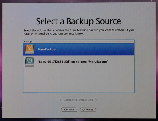
Once I selected the first disk, for some reason it defaulted to showing me an ancient backup I didn’t even know I had, rather than the most recent backup available (why?)
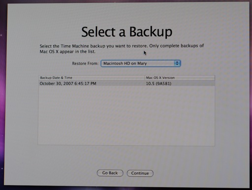
I never reinstalled Mac OS X, just renamed the disk after upgrading the iMac from TIger to Leopard, but that seems to be enough to throw off Time Machine.
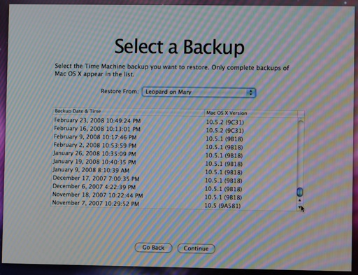
Ah yes, the day the hard drive died while I was far away in New York.
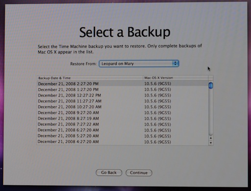
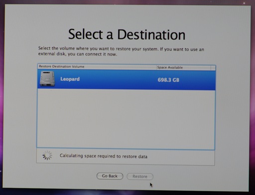
The restore utility took quite a while to “calculate space required to restore data”. I’m not sure why it bothered—the backup drive is actually smaller than the new destination drive, and in any case, when calculation is complete, it doesn’t even display the results and proceeds to erase the destination disk.
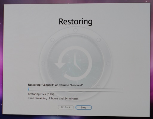
The time remaining indicator was wildly incorrect: after initially climbing over 8 hours, it didn’t take more than a couple of hours to perform the restore.
Once the restore was complete and I rebooted into OS X, nearly everything was fine. The usual culprits (Mail caches, Spotlight, MobileMe syncing) were understandable, but I lost a few odd things like my input method configuration (Spell Catcher came up though I had it disabled) and Spaces keyboard shortcuts (not even the defaults were selected; I had no way of navigating Spaces until I reset them).
 2:31 AM
One wonders why they display the build number along with the OS version in the Time Machine dialogue. Doesn’t look like the kind of information that will help my mum – rather adds to the confusion.
(I think the tab order in the form fields for commenting is wrong.)
At least unlike some of the other UI decisions in the Time Machine restore utility I can see why they made that one: it’s useful for OS developers and external testers who often use multiple builds of the same version.
The tab order for me is name-email-website-OpenID-comments. If you’re logged in, you only see a comments field. Does the same order appear for you, or do you have another suggestion? (I wish I could get back the time I spent fixing the WordPress OpenID plugin; nobody’s ever used it and in the cases where I use OpenID myself, such as on iusethis, I wish I hadn’t; OpenID usability is not there yet.)
I’d say that it’d be sufficient to hide a developer option behind some extra keystroke. Better than intimidating Aunt Sally with it, at least.
The tab order is the same here. But the display order is name on line 1, email/openid on line 2, website on line 3. So I’d expect the tab order to match that.
Couldn’t agree more about the Open ID thing, BTW. Not only does that so-called ‘icon’ look like a broken cursor for typing (it took me half a year to figure that much out…), I also keep forgetting my own Open ID address and nobody seems to use it. A shame really, because an idea along those lines seems to be a good thing.
If you use your OpenID you don’t need to provide any of that stuff. Oh well, I’d fix it if anyone were motivated to use it.
Thanks for the advise, can you use this method to move all you data from one computer to another? I’m planning on buying a new bigger MAC.
Absolutely, you can, though if you’ve got the computers connected together, using the Migration Assistant directly may be easier.