Sunday, 1 November 2015
SGI screen fonts converted for OS X
The first Unix machines I sat at on a daily basis were the SGI Indys in the Berry Patch. IRIX’s proportional system font was Adobe Helvetica Oblique, which was nice; but its monospaced font was unique and home-grown, simply called screen. Here are a couple of screenshots I took in that environment nearly 20 years ago.
Screen remains the most readable monospaced bitmapped font I've ever used. It’s available in regular and bold weights, and a wide range of sizes: 7, 8, 9, 10, 11, 12, 13, 14, 15, 16 and 18 point. While I mostly use it in the 11 point size, the smaller sizes are terrific for fitting a bunch of log output in the corner of your screen.
After switching my desktop from Mac OS/Linux to Mac OS X in 2001, I initially used Monaco in both aliased and antialiased variants, but missed screen. I continued using screen in X11, running applications on the SGI O2 I then had on my desk, displaying remotely on my Power Mac G4.
In 2003 I used PfaEdit, now FontForge, to convert screen to a TrueType font so it’d work on OS X, and I have used it as my standard bitmapped font since. I would have made the conversions public earlier, but I was concerned about whether this would be a licensing violation. It turns out the SGI fonts were released under a MIT license a few months after I initially converted them back in 2003, but I didn’t notice until today. So, here are the fonts for you to download:
- Screen Medium (TrueType)
- Screen Bold (TrueType)
- Screen (Windows FON format, not my conversion but provided for convenience)
You may notice that these fonts look awful — with inconsistent horizontal and sometimes vertical spacing, even clipping — whenever you try to use them. Recent versions of OS X have been less kind to bitmapped fonts; here are some tips.
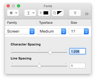
In Terminal, you can compensate for the font being squashed horizontally by adjusting the Character Spacing:

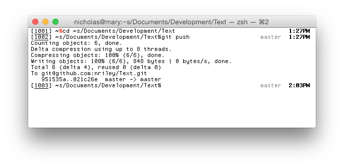
The result:

In the Emacs Mac port, you can disable antialiasing and ensure screen font metrics are used on a per-font basis. Here’s how I use Screen 11 if it’s installed, otherwise Menlo 12.
(cond ((eq window-system 'mac)
       (cond ((x-list-fonts "Screen")
	      (create-fontset-from-ascii-font "Screen-11" nil "mac")
	      (set-fontset-font "fontset-mac" 'latin
				"Screen-11:antialias=off:destination=1"))
	     (t
	      (create-fontset-from-ascii-font "Menlo-12" nil "mac")
	      (set-fontset-font "fontset-mac" 'latin
				"Menlo-12")))
       (setq default-frame-alist '((font . "fontset-mac")
				   (width . 80) (height . 80)
				   (background-color . "ghostwhite")))
       (setq-default line-spacing 1) ; extra spacing
[...]
What you get:

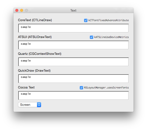
In 2008 I built a demo app to demonstrate the various issues OS X had rendering this font, but I never actually filed any bugs. As long as I’m sharing the fonts I might as well share the app (source, binary). It uses a boatload of deprecated/removed API like QuickDraw and ATSUI, mostly to demonstrate how newer font APIs, such as the then-new CoreText, are worse at displaying bitmapped fonts than their older counterparts. You can click the checkboxes at right to see options you can use with the various APIs to try to fix the spacing:

Most Cocoa apps used to display the font without difficulty, but this changed in OS X 10.8 and later, which no longer perform screen font substitution by default. You can fix the font’s display by forcing the old behavior with NSFontDefaultScreenFontSubstitutionEnabled or NSLayoutManager.usesScreenFonts (which is deprecated in 10.11). These are discussed in the AppKit release notes (there’s no direct link but if you scroll up a little from the linked section you'll see it).
Bitmapped fonts are much less useful on a Retina display. A 5K iMac or equivalent is likely in my future when I replace my Mac mini, but not for a year or two as I just bought its current display this year. In any case, I may be posting this just as it’s about to become obsolete. Better late than never?
 12:47 PM
[…] Nicholas Riley: […]
Have you tried Bitstream Vera? Ever since I started using that font it has been my goto font for the terminal. I also 11 pt in my terminal.
http://imagebin.ca/v/2LD6Yk7Koj9d
Can you explain why an oblique font is not oblique?
http://img.docstoccdn.com/thumb/orig/52529593.png
Actually, OS X already includes a font based on Bitstream Vera (and DejaVu Sans Mono) since Mac OS X v10.6 Snow Leopard:
Menlo
https://en.wikipedia.org/wiki/Menlo_(typeface)
For long I intend to do the same for Misc Fixed. I could use FontForge to create a .fon file for each individual size. But I don’t know how to combine them into one file, like you have. Could you share the command being used?
Steve — sorry, no idea what you are talking about. I don’t make up font names!
juubit — thanks. I’m talking specifically about bitmapped fonts here, which I find more usable for monospaced viewing on a low-resolution display than antialiased outline fonts. In fact, on my Retina Mac I do use Menlo currently (as you can see by the Emacs snippet I posted).
Dhaval — indeed, I currently use Menlo which is a variant of Bitstream Vera Sans Mono.
Xiaoqiang — you’re asking me to remember ancient history, sorry :-( I have no recollection of how I did it.
Oh, that is lovely – I have an O₂, and I when I saw this I vaguely remembered its terminal font as being fairly nice. I just installed the windows version, and experimentally changed a few putty sessions over; I think I’ll keep them like that for now. It needs to be size 11+ for the bold to look good, though.
I provided a link to the type face family of Helvetica (tm, Linotype GmbH).
Although you do not make up the names, the names are copyright, and the outlines are copyright.
The glyphs are not. The glyphs can take any name they want.
The font ‘Screen’ is extremely readable at small font sizes, and perfect for programming, and large text displays.
OS X is not kind to bit mapped fonts. ( you should see the original Monaco… )
Thanks for your work.
Great font and work, but no latin-extended and cyrillic characters (useless outside of USA/UK)/colonies).
Yeah, the font design is old enough that it just covers ISO-8859-1, so western European languages are pretty much it. I’m not aware of any other character sets that were implemented that I could steal character bitmaps from. OS X’s Terminal does a pretty nice job of substituting fonts that actually *do* include the necessary characters without disrupting the line layout, but I can’t see that this would be useful if your primary language doesn’t overlap with the available character set.
Here is the full character set, for reference:
Hey, it is open source now, if you’re looking for a project :-)
Current MacOS releases for some reason add significant top and bottom padding to the medium weight font. Why is that?
Dunno, but in general support for bitmap fonts has nearly disappeared in newer macOS versions, so I suspect it’s just untested/broken. I still use Screen in Terminal in 10.15 with the Line Spacing set to 0.5, but have not tried in macOS 11/12.