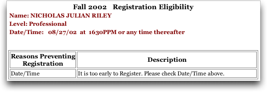
UIC's registration system continues to impress me with its ease of use and implementation (not). At orientation last week, we were given a number of not-so-subtle hints that the grass is not exactly greener at the Chicago med school… i.e., we're lucky to be here. I've already documented one of the worst Web interface designs I've seen (it's still there), but this one is good too:

Programmer 1: We need to tell the students what their registration time is when they can't register yet; here's a time field we can use.
Programmer 2: Just display it, then.
Programmer 1: It's in 24 hour format. So we need to convert that into AM or PM. Here, I've got this code that takes the current time and displays AM or PM.
Programmer 2: No, don't bother, we're already behind on this project, people can figure it out and this will save us some time. Just use your existing code.
Programmer 1: But that'll give the wrong answer half the time!
Programmer 2: Just add a “P” to confuse people so they don't actually try to interpret the AM or PM but still realize it's a time.
Programmer 1: Uh, sure.
 11:21 PM